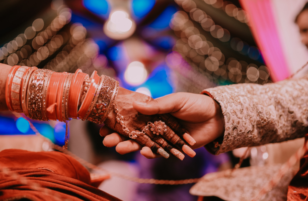
When it comes to weddings, every little detail matters, and your invitation card is the very first thing that your guests will get to see. That’s why wedding card printing is not just a task—it’s an art that demands careful planning and thoughtful execution.
Achieving flawless results with wedding card printing is not as simple as choosing a design and sending it off to the printer. It requires a series of careful decisions—from selecting the right paper and ink to ensuring that the colors, typography, and finishes reflect your personal vision perfectly.
In today’s world, with so many wedding invitation printing services available, couples often find themselves overwhelmed. Offset printing, digital printing, letterpress, foil stamping—the choices are endless, and each has its unique advantages.
To help you avoid common pitfalls and ensure that your wedding invitations are as flawless as your love story, we are going to provide you with the tips.
Let’s explore the 10 expert tips that will help you achieve flawless results and make sure your wedding cards turn out flawless.
1. Choose the Right Printing Technique
One of the first and most important decisions in wedding card printing is selecting the right technique. Different methods create different effects, and each has its pros and cons.
Offset Printing
Offset printing is widely used. It produces sharp, consistent images and works well for large quantities. If you are planning to print many wedding cards, offset is cost-effective and delivers high-quality results.
Digital Printing
For smaller batches, digital printing is ideal. It is faster, cheaper for low quantities, and allows for personalization, such as including guest names directly on the card. However, it may lack the richness of offset printing in terms of color depth.
Letterpress & Embossing
If you want a luxurious feel, letterpress printing is perfect. It creates an impression in the paper, giving the card a tactile quality. Similarly, embossing adds a raised effect to patterns or names, which looks elegant. These are more expensive but add sophistication.
Foil Stamping
For metallic accents like gold, silver, or rose gold, foil stamping adds a shiny finish that looks premium. Couples often use foil stamping for names, initials, or borders.
By carefully comparing these techniques based on budget, theme, and desired finish, you can ensure flawless wedding card printing.
2. Select the Best Paper Quality
Paper is the foundation of wedding card printing. Even the most beautiful design can look unimpressive if printed on flimsy or poor-quality paper.
GSM (Grams per Square Meter)
GSM is important for wedding invitation paper, it refers to the thickness of paper. Wedding cards generally use paper between 250 to 400 GSM. A higher GSM feels sturdier and luxurious, while lower GSM may seem cheap. Always hold samples to feel the difference.
Texture and Finish
Paper comes in various textures: smooth, matte, glossy, or handmade. Matte paper gives a classy look, glossy paper enhances bright colors, and textured or handmade paper adds a rustic or traditional touch. Now how to choose wedding color and theme depends on you.
Durability
Cards often travel by post or courier. Durable paper ensures the card doesn’t bend, tear, or smudge easily. Waterproof or laminated finishes can also provide protection.
Sustainability
Eco-friendly couples may opt for recycled or plantable seed paper, which not only looks unique but also aligns with sustainable wedding practices.
In short, the choice of wedding invitation paper significantly influences how luxurious invitation it will be. Investing in the right quality ensures flawless card printing that impresses guests at first touch.
3. Pay Attention to Color Accuracy
Colors play a crucial role in wedding card printing. They represent emotions, traditions, and your overall wedding theme. However, color inconsistencies often become a major issue. Even for a digital invitation, accurate colors matter, as they reflect the theme and mood of your wedding perfectly.
CMYK vs. RGB
Printers use CMYK (Cyan, Magenta, Yellow, Black) color models, while digital screens display RGB (Red, Green, Blue). What you see on a computer screen may look slightly different when printed. Always ask your printer for proofs to check accuracy.
Pantone Colors
For precise shades, Pantone color matching is recommended. It ensures the exact hue is replicated in every card, eliminating inconsistencies. This is especially important if you want a specific wedding theme color like “royal blue” or “pastel peach.”
Test Prints
Never depend only on digital previews. Request a sample print before finalizing the entire batch. This helps you check whether the colors look vibrant, dull, or too dark in actual print.
Paper Effect on Colors
Remember, colors appear differently on various paper types. Glossy finishes make colors pop, while matte may soften them. Dark paper backgrounds may also mute lighter shades.
By ensuring accurate and consistent colors, you maintain harmony with your wedding theme and achieve flawless printed wedding invitation that looks professional.
4. Choose the Right Fonts and Typography
Typography is often underestimated, but it is central to flawless wedding card printing. The right font conveys elegance, while poor choices make the design look cluttered or unreadable.
Font Styles
Classic serif fonts like Times New Roman or Garamond look formal, while script fonts give a romantic and elegant touch. Sans-serif fonts are modern and minimal. Many couples prefer mixing two complementary fonts: one for headings and another for body text.
Font Size
Font size should balance readability with aesthetics. Names and event titles are usually larger, while details like dates, venues, and RSVP information should be smaller but still clear.
Spacing and Alignment
Proper line spacing ensures readability. Text should not look crammed together or too spread out. Centered alignment is most common for wedding cards, though modern designs sometimes use left alignment for a sleek look.
Embossing and Foil with Fonts
Enhancing typography with embossing or foil stamping makes names stand out beautifully. Using gold foil on couple names adds a touch of luxury.
By thoughtfully selecting fonts and ensuring balance in size, style, and alignment, your wedding card printing will look elegant, clear, and timeless.
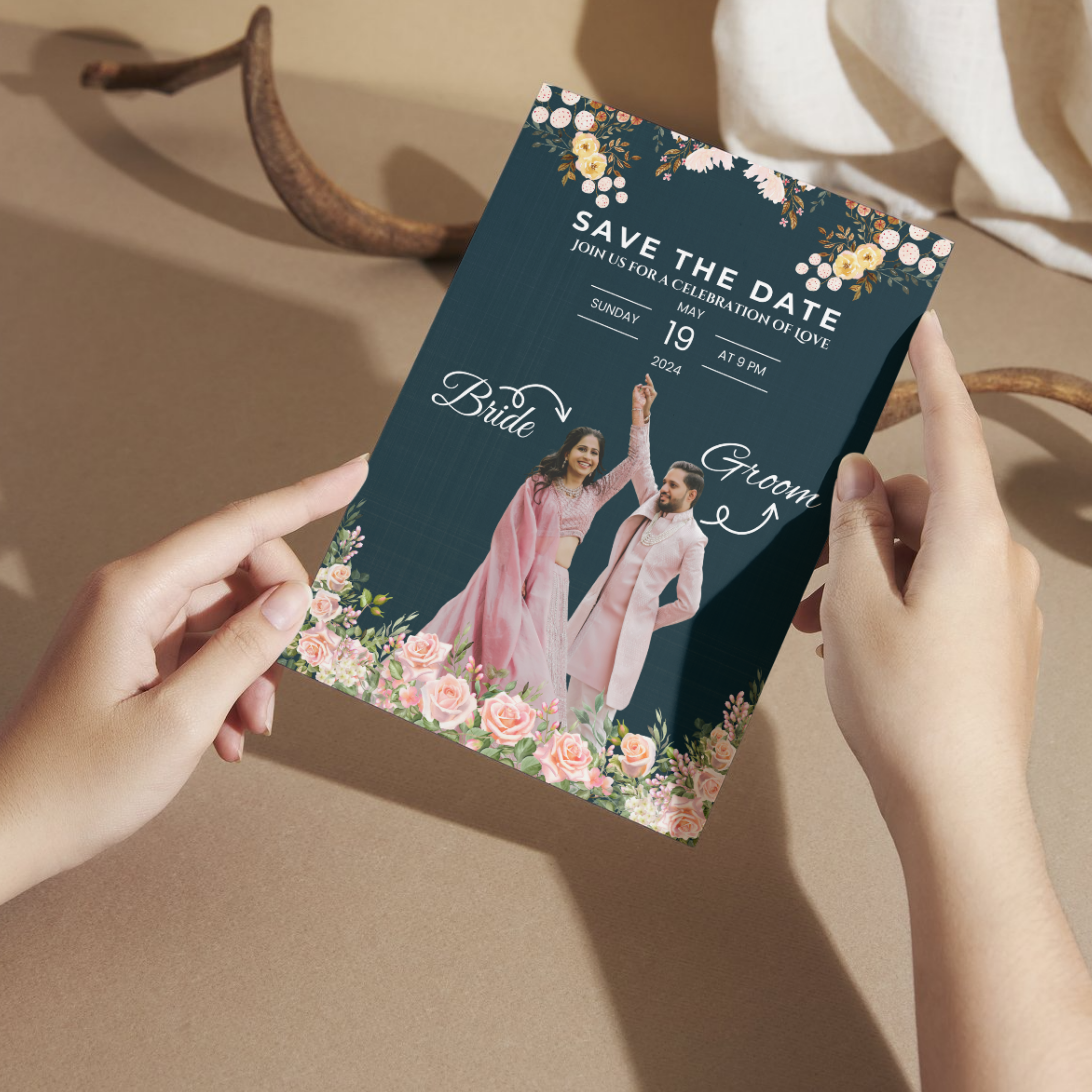
5. Incorporate High-Quality Images and Graphics
If your wedding card design includes images, illustrations, or motifs, their quality directly affects the print outcome. Photo wedding invitations require high-quality printing to ensure every detail and color in your images looks sharp and vibrant.
Resolution
Always use high-resolution files (at least 300 DPI) for printing. Low-resolution images may look fine on screen but appear pixelated when printed.
Vector Graphics
For icons, borders, or patterns, use vector graphics. Unlike raster images, vector files can be resized without losing quality, ensuring sharp and clean designs.
Cultural or Personal Elements
Including meaningful symbols, such as traditional motifs, floral patterns, or couple wedding logos, adds personalization. Ensure these graphics are properly aligned and don’t overshadow the text.
Color Contrast
Images should complement, not clash, with text colors. For instance, light-colored text may get lost against a busy background image. Designers often use semi-transparent overlays to balance readability.
By using high-quality visuals thoughtfully, you elevate your wedding invitation card printing and create invitations that are visually striking and meaningful.
6. Proofread Every Detail
Nothing ruins a wedding card more than spelling mistakes, incorrect dates, or missing details. Proofreading is a crucial step in flawless wedding card printing.
Multiple Reviews
Never rely on one person for proofreading. Share the draft with family members or friends to catch errors you might miss. Fresh eyes often spot mistakes easily.
Check Key Details
Confirm names, venue address, dates, and times. Even a small typo, like “Pm” instead of “PM,” can look unprofessional. Double-check spellings of family names, especially if they are less common.
Language and Tone
Ensure the wording matches the tone of your wedding. Formal wedding invitations may use traditional phrases, while casual wedding invitations may prefer modern language.
Final Digital and Print Proofs
Always review both digital previews and physical test prints. Sometimes spacing, alignment, or punctuation errors become visible only after printing.
By dedicating time to thorough proofreading, you avoid costly reprints and ensure flawless wedding card printing that leaves no room for embarrassment.
7. Maintain Consistency with the Wedding Theme
Your wedding card is the first introduction to your theme, so it should reflect the overall vibe of your celebration. A card that reflects your wedding theme creates harmony and excitement, setting expectations for the event.
Color Palette
If your wedding colors are blush pink and gold, incorporate them into your card design. Consistency creates harmony and sets expectations for décor, attire, and ambiance.
Style Matching
A royal, traditional wedding invitation may call for intricate motifs and rich colors like maroon and gold. A modern beach wedding might favor pastel shades and minimalistic designs.
Symbolic Elements
Include cultural or religious motifs that resonate with your family traditions. This adds authenticity and emotional value to the wedding invitation card printing.
Matching Stationery
Your wedding card printing should match other stationery like save-the-dates, menus, or thank-you notes. A cohesive design ties the entire event together.
Ensuring consistency with your theme makes the card not only an invitation but also a storytelling element for your big day.
8. Work with Professional Printers
While DIY invitations are tempting, professional printers bring expertise that ensures flawless results. When it comes to wedding invittaion printing, working with professional printers can make the difference between a mediocre card and an elegant, flawless invitation.
Experience and Portfolio
Always check a printer’s previous work. Experienced professionals understand paper, color, and design better, reducing chances of error.
Equipment and Technology
Advanced printing machines ensure sharp results, accurate colors, and consistent quality across hundreds of cards.
Guidance and Support
Professional printers can suggest improvements, such as better paper options or font adjustments, that you might not have considered.
Reliability
Deadlines are critical in weddings. A trusted printer ensures timely delivery without compromising quality.
By choosing professionals, you save time, reduce stress, and guarantee wedding card printing that lives up to your expectations.
9. Budget Smartly Without Compromising Quality
Wedding expenses add up quickly, but your invitations should not be compromised. Smart budgeting helps balance cost and quality.
Prioritize Essentials
Spend on high-quality paper and professional printing rather than excessive embellishments. Guests value durability and readability more than over-the-top decorations.
Print in Bulk
Ordering a slightly higher quantity is often cheaper than multiple smaller batches. It also saves you from last-minute shortages.
Mix Techniques
Instead of using foil stamping on the entire card, highlight only the couple’s names or borders. This reduces costs while still looking elegant.
Compare Printers
Check pricing options from various vendors. Some may offer discounts for bulk orders or package deals with envelopes included.
By budgeting wisely, you ensure flawless card printing without overspending, striking the right balance between elegance and practicality.
10. Don’t Forget the Finishing Touches
The final stage of wedding card printing is where your invitation truly transforms from a simple card into an elegant, memorable keepsake. Finishing touches are what give your cards a polished, high-quality feel, making them stand out in the hands of your guests. Skipping this step can make even the most beautiful designs look incomplete or cheap.
Lamination and Coating
Matte or glossy lamination protects the card from smudges and enhances the appearance. Spot UV coating highlights specific areas like names or designs.
Die-Cutting and Shapes
Custom shapes, such as scalloped edges or unique folds, add creativity. These details make the card memorable and unique.
Envelopes and Seals
A beautiful card deserves an equally elegant envelope. Matching colors, wax seals, or ribbons create a luxurious first impression.
Packaging and Delivery
Ensure safe packaging to prevent bending or damage during delivery. If mailing, consider sturdy wedding invitation envelopes or boxes for added protection.
These finishing touches transform a simple card into a keepsake that guests will cherish, completing your flawless wedding card printing journey.
Conclusion
Perfect wedding card printing is a combination of early planning, thoughtful decisions, attention to detail, and professional support. Your wedding invitation is more than just a card; it’s the first chapter of your wedding story that guests will experience. By following these expert tips, you can ensure that your invitations are as flawless and memorable as the day itself.
Whether you opt for luxurious letterpress or budget-friendly digital printing, what matters most is the love and care you pour into each decision. Trust the process, work with skilled professionals, and always stay true to your vision.